Partner Logo Onboarding
This guide covers the requirements and recommendations for submitting your partner logo assets. All logos should be provided in SVG format to ensure crisp rendering across devices and resolutions.
Logo Requirements
Your primary logo will be displayed in the partner-facing application header and marketing materials. Please ensure the asset meets the following requirements:
- Format: SVG (Scalable Vector Graphics)
- Aspect ratio: The logo should maintain its original aspect ratio with a recommendation of 3:1 minimum (width:height)
- Color: Provide a full-color version suitable for display on both light and dark backgrounds, or supply separate variants for each
- File size: Keep the SVG file around 3kb or less for optimal loading performance
- Text elements: All text must be converted to outlines/paths so the logo renders correctly without requiring custom fonts
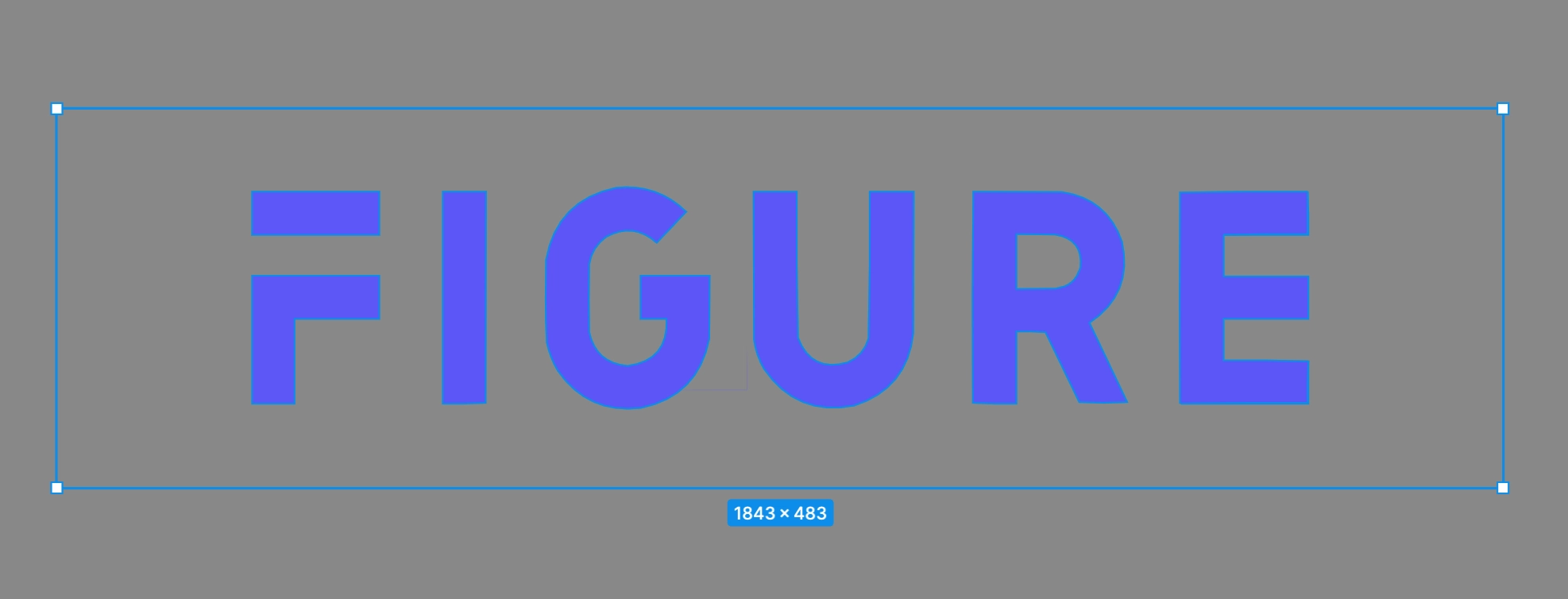
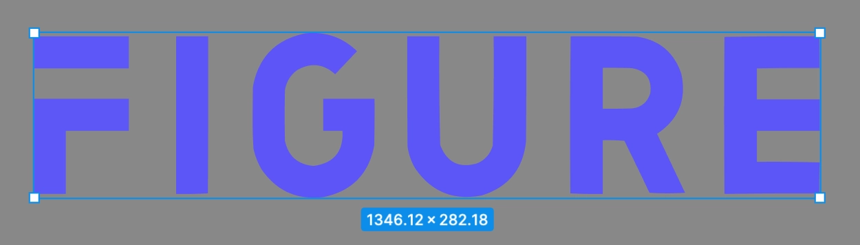
Example:

Square Logo Requirements
A square logo is used for compact placements such as favicons, mobile app icons, and thumbnail previews. Please ensure the asset meets the following requirements:
- Format: SVG (Scalable Vector Graphics)
- Aspect ratio: Must be 1:1 (square), with a recommended size of 192x192 pixels
- Content: Typically an icon mark, monogram, or abbreviated version of the full logo
- File size: Keep the SVG file around 3kb or less for optimal loading performance
- Text elements: All text must be converted to outlines/paths
Example:

Recommendations
The following recommendations help ensure your logo assets render cleanly and consistently across all placements.
SVG Optimization
Optimizing your SVG files reduces load time and avoids rendering inconsistencies:
- Remove unnecessary metadata, comments, and editor-specific attributes (e.g., Illustrator or Figma artifacts)
- Use a tool such as SVGO or Jake Archibald's SVGOMG to minify the file
- Avoid embedded raster images (e.g.,
<image>tags with base64-encoded PNGs) inside the SVG — these defeat the purpose of a vector format - Prefer
viewBoxover explicitwidth/heightattributes so the SVG scales fluidly
Internal Container Padding
Try and remove as much internal container padding as possible to avoid having the logo appear too small.
-
Example of internal container padding:
-
Example of minimal internal container padding:
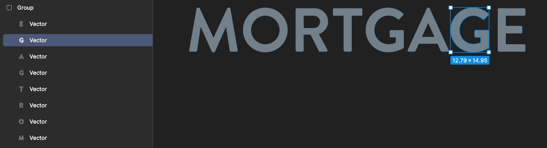
Separate Letters/Components
If your logo is composed of individual letterforms or distinct graphic components:
- Keep each letter or component as a separate
<path>or<g>(group) element within the SVG rather than merging everything into a single compound path - This preserves the ability to apply consistent spacing, alignment, and color treatments across different display contexts
If you have any questions about logo specifications, please reach out to us at partner-help@figure.com.